Why your website has a Low Conversion Rate? (Guide to Improve conversion rates)
No matter how great your business is, if customers don't get to understand what your business does just by reading the website, they'll simply lose interest in what you have to offer
And with declining attention spans, it shouldn't come as a surprise that you need to structure your website in such a way that it holds your reader's attention and prompts them to take action
This is the basic idea behind a website conversion
If it still seems confusing, don't worry. I've got you covered with this article!
What is conversion?
In simple terms, a conversion refers to the desired action a visitor takes on your website.
The interesting part is that it varies based on the goals of the business
For instance, if you're running a content business, you'd measure conversions as people engaging with your content or signing up for your newsletter
Conversions are generally the actions taken by a customer that directly contribute to the revenue of your business
To give you a better understanding here are some common types of conversions for a business:
- E-commerce: For an online store, a conversion occurs when a visitor makes a product purchase.
- Lead Generation: For businesses focusing on getting high-quality leads, a conversion would be a visitor filling out a contact form, subscribing to a newsletter, or requesting more information.
- Content Engagement: Content-focused websites consider conversions as users engaging with the content such as reading articles, watching supporting videos, or spending a certain amount of time on the site.
- Account Sign-ups: For product-based websites, conversions focus on getting visitors to convert into registered users by encouraging them to create accounts.
- Social Media Engagement: For businesses focused on social media presence, conversions may include likes, shares, follows, or other forms of social engagement.
- Downloads: If a website offers downloadable content such as ebooks, whitepapers, software, or apps, a conversion could be the successful download of these items.
- Event Registration: Websites promoting events might consider registrations or ticket purchases as conversions.
This is why tracking conversions is very important for you as a business owner since it has a direct influence on your business's top-line revenue
We'll have a detailed look at how that could be done in the following sections
What is meant by conversion rate?
Conversion rate is a metric that measures the percentage of website visitors who take the desired action on your website, that is, a "conversion."
As we saw in the previous section, this action could be making a purchase, filling out a form, signing up for a newsletter, or any other goal that the business owner intends for a customer to do on their website
The formula for calculating the website conversion rate is:
Conversion Rate = (Number of Conversions/Total Number of Visitors) × 100
(expressed in %)
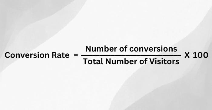
As simple as it sounds, it's the ratio of the number of successful conversions to the total number of visitors, expressed as a percentage.
A higher conversion rate indicates that a larger proportion of visitors are completing the desired action, showing that your website is in line with customers' interests
And a lower conversion rate could mean that a customer hasn't fully understood what your business does or its value proposition on your website
Monitoring and analyzing conversion rates are very important so that you understand how well your website performs compared to peers in the industry
A good conversion rate is an advantage because you can minimize your ad costs as you'll get more sales with the same number of traffic
Average Conversion Rates by Device:
- Desktop: Desktop users show higher conversion rates, averaging between 3% and 5%, as they tend to have a stable browsing experience along with easier navigation.
- Mobile: Mobile conversion rates are typically lower, averaging between 1% to 3%, partly due to the smaller screen size, or coming from a social media app and sometimes due to less optimized mobile shopping experiences.
- Tablet: Tablet conversion rates can be similar to desktops, often falling in the 3% to 4% range, as they balance mobility and usability.
Conversion Rates by Industry:
Here are the landing page conversion rates by industry:
| Industry | Average Conversion Rate | Median Conversion Rate |
|---|---|---|
Agencies | 8.8% | 2.4% |
Real Estate | 7.4% | 2.6% |
Software as a service | 9.5% | 3.0% |
Family Support | 9.0% | 3.4% |
Business Services | 8.7% | 3.5% |
Medical Services | 7.4% | 3.6% |
Home Improvement | 7.2% | 3.8% |
Travel | 11.9% | 4.8% |
Events & Leisure | 13.4% | 5.2% |
Ecommerce | 12.9% | 5.2% |
Legal | 14.5% | 5.4% |
Fitness & Nutrition | 13.2% | 5.6% |
Education | 14.2% | 5.8% |
Finance & Insurance | 15.6% | 6.2% |
Media & Entertainment | 18.1% | 7.9% |
Catering & Restaurants | 18.2% | 9.8% |
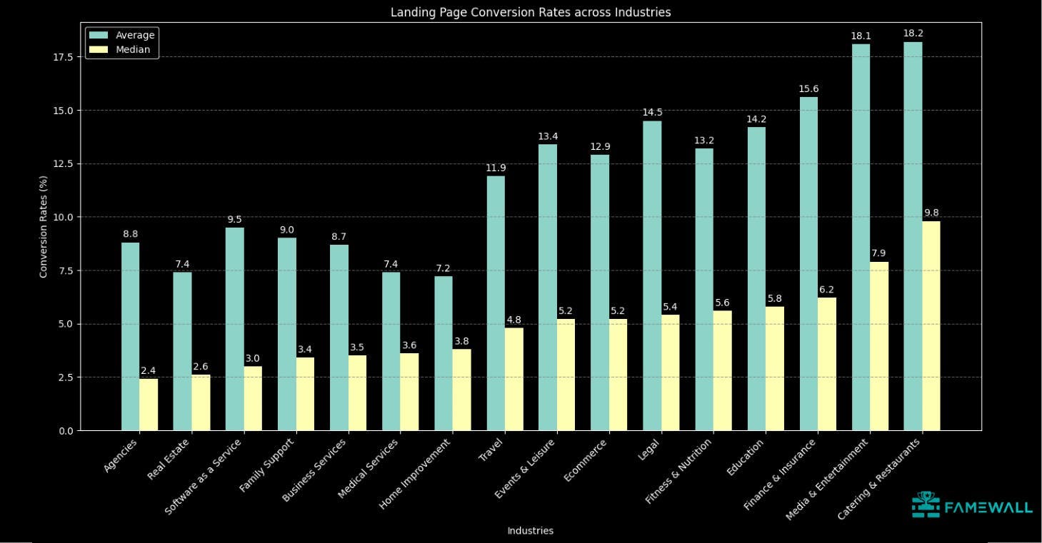
The table above includes the median and the average conversion rates for 16 industries from a conversion benchmark report
The finance and insurance industry has a conversion rate of 15.6% which is the highest among all industries.
The biggest reason is that the people visiting finance & insurance landing pages are usually at a point where they have a specific need, like buying a house, planning for retirement, etc.
This focused intent makes them more receptive to the value proposition offered on the landing page, leading to higher conversion rates.
The industry with both the highest average and the highest median conversion rate is Catering & Restaurants with an average rate of 18.2% and a median rate of 9.8%
What are the reasons for a low conversion rate?
You could have the best website with a modern UI but still see a low conversion rate if the landing page copy does not resonate with your customers
Several such factors play a key role. Let me show you some of the reasons
Lack of trust
When you are purchasing on a website using your credit card, you'd want to be sure that the website is trustworthy
It shouldn't come as a surprise that customers too look for trust signals when they're visiting a landing page
This has a direct effect on your landing page conversions. For example, let's look at the hero sections of 2 landing pages
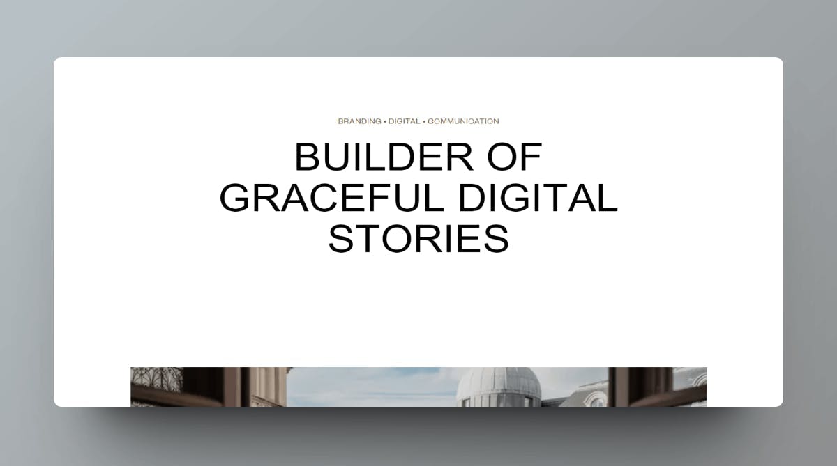
Trust Signals Version 1:
This is a hero section of an agency website which has a generic copy as it's H1 tag and with a generic image below the fold
Trust Signals Version 2:
Here is another agency's hero section with a much more direct hero H1 supported by trust signals with the customer's company logos displayed below it
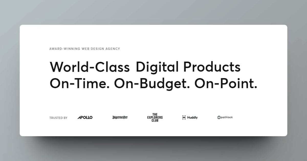
As you can easily see, version 2 has more trust signals with a friendly copy backed by trustworthy images
Version 2 is much more likely to have higher conversion rates
You can use several trust signals on your landing page like customer reviews, testimonials and company logos
Here is an example of social proof avatars that show prominent customers.
It is built with Famewall and used directly on its landing page to build trust with new website visitors
![]()
No social proof
Testimonials and customer reviews are important now more than ever.
In fact, according to a consumer research study, 92% of customers read online reviews before making a purchasing decision
Businesses have used every trick in the book to convince customers to convert. And naturally customers get a bit more aware
That's indirectly led to people trusting customer reviews & testimonials more than a business marketing message.
Here is an example of a website that sells public sign boards to businesses.
But there aren't any testimonials or reviews from customers on how the sign boards helped their business' discoverability
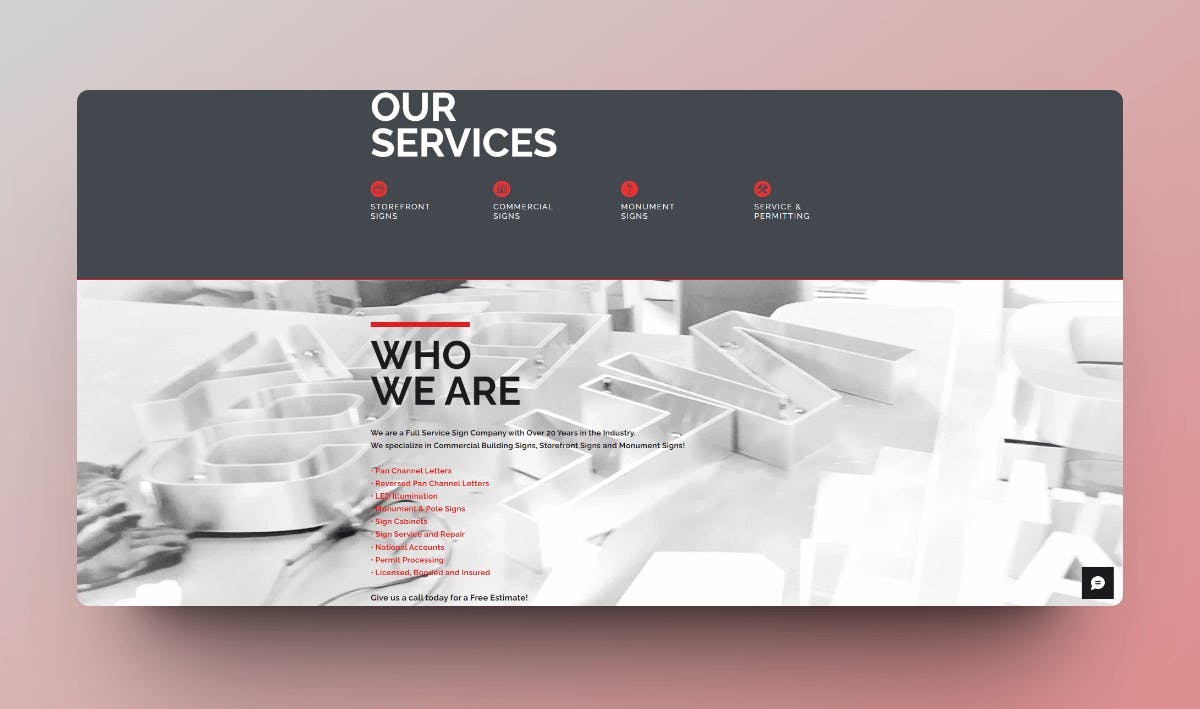
The testimonials would help potential customers visualize the outcomes for their own business and convince them to convert
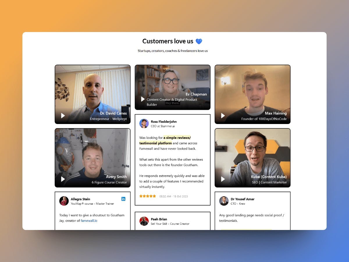
Here's a public testimonial wall built using Famewall which consists of a mix of text and video testimonials building trust with website visitors
Unappealing design
Customers have a very low attention span.
If your website doesn't impress them at first glance, there's a high chance that website visitors will simply bounce
A well-designed website gives customers the impression that you care about their experience even before they sign up for your product
There are plenty of no-code tools available these days which can help you build a website quickly. Otherwise you can get the help of web development companies for the same
Let's look at 2 examples of website design
Unappealing Website Design Example:
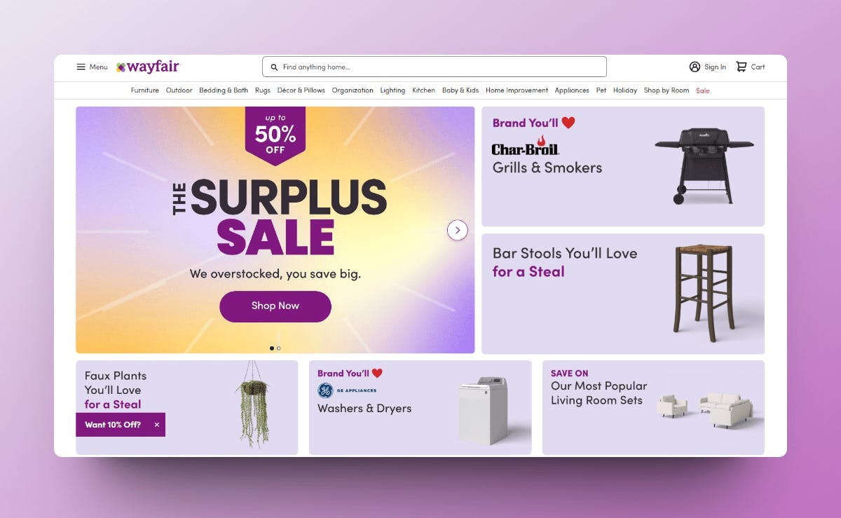
This here is the home page from Wayfair. The problem is that a lot is going on immediately once you open up the home page
They would easily get overwhelmed due to the bad hierarchy and leave the website after experiencing decision fatigue
Bad copy
Now that you have a website with good design and social proof, the next important thing you need to focus on is your website copy
Copy is the content written on a website, including headlines, text blocks, and buttons
It communicates with the user and helps them understand what your business does and how it can help them solve their problems
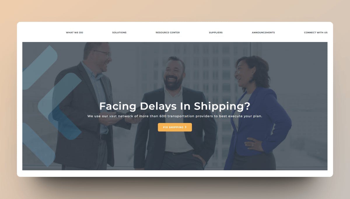
Here's an example of a copy that sounds vague and confusing for potential customers

Here's a copy that is more clear and communicates the value a customer derives by using their product/service
You can use Famewall's free landing page copy generator to assist you with writing a good copy
Bad user experience
User experience is the overall feel & experience a user has when interacting with your landing page
It could be as simple as having a clear website structure and making the navigation intuitive for users
A bad UX can have a big impact on your landing page conversions since most of the time it would confuse website visitors and leave them frustrated
Here is a landing page of a hair studio and there's a problem with this UX
It has a form open on the right side of the hero but then again once it's been 2 seconds after visiting the landing page, an intrusive popup opens up with the same content
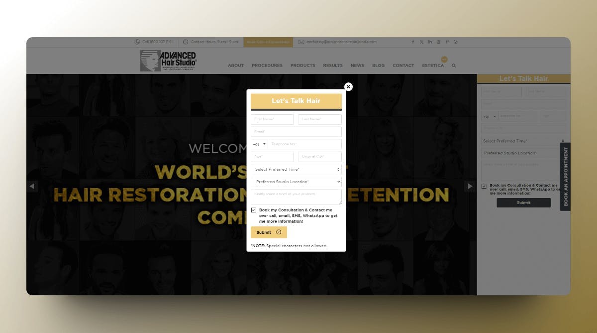
Popups can very well be informative and helpful to sell lead magnets but business owners need to be careful not to sacrifice a user's experience just to get more leads
This would do more damage to the brand because frustrated users will have a bad impression upon the first visit and never return to the website
Poor Images
When readers come across poor images on your website, they get frustrated and leave the website
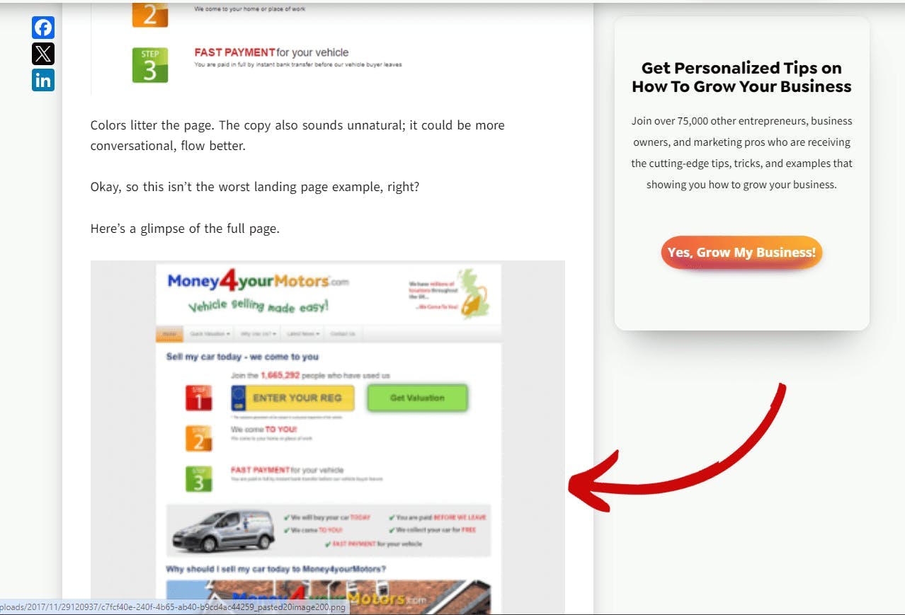
Here is a blog with a good structure and layout but unfortunately has poor-quality images
How to improve a low conversion rate?
Now that we've seen the reasons for a low conversion rate, let's have a look on how the conversion rate can be improved
Improving website performance
Website performance directly contributes to a better user experience.
Having a clean website design with easy navigation greatly improves conversion rate.
A good website performance also improves rankings in organic search thereby bringing more traffic and increasing your conversions
Improve copywriting
A good copy on your landing page can do wonders.
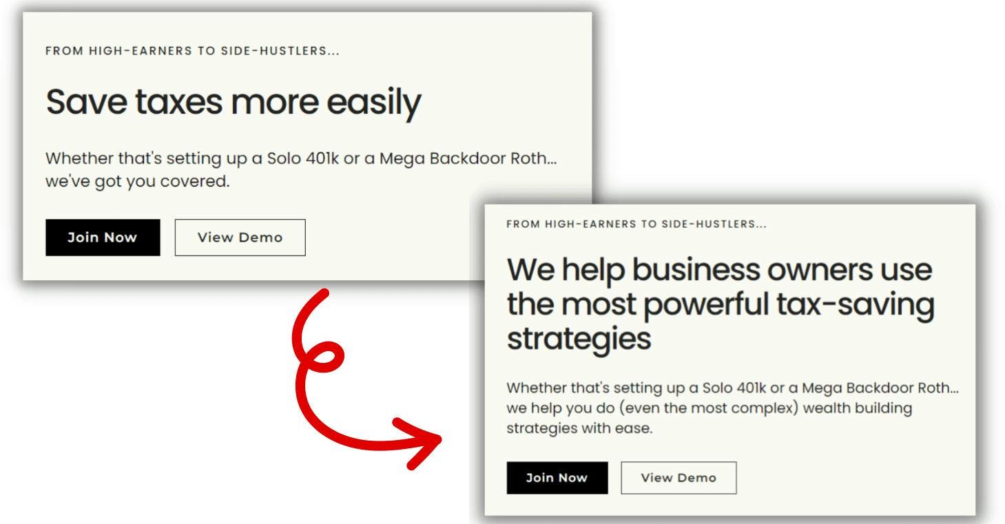
Be more specific about your offer and use easy-to-understand words over jargons. It makes the readers curious and stay invested in what you have to sell
Here is an example of a landing page copy with the hero made better using specific copy to the right target audience
Collect testimonials
Testimonials and social proof make customers trust your business especially when they're visiting your website for the first time
You can use Famewall to collect testimonials from customers and display them as social proof in your website to convince more customers to convert
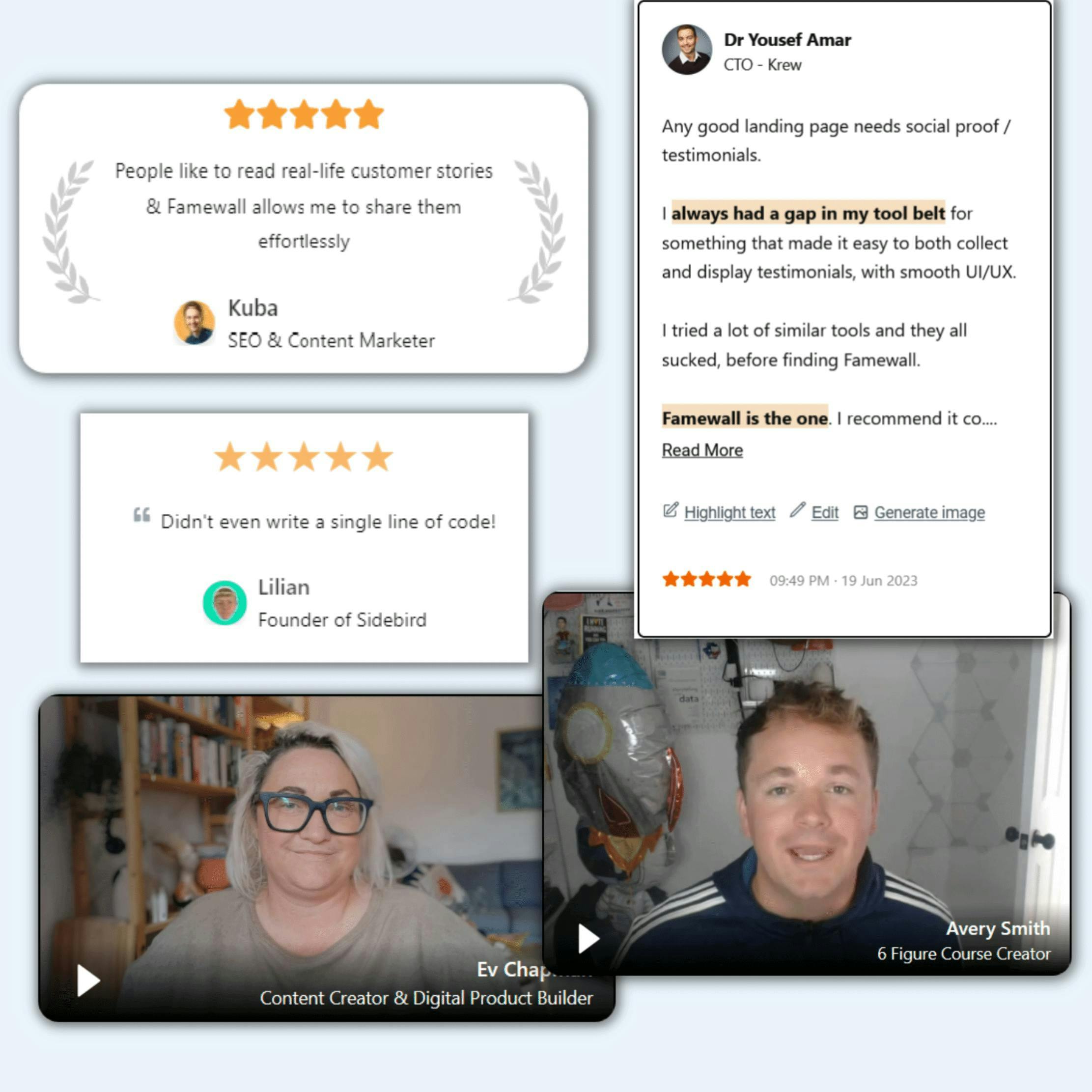
Apart from this you can also use the variety of testimonial widgets to use social proof. This can greatly improve your landing page conversion rate
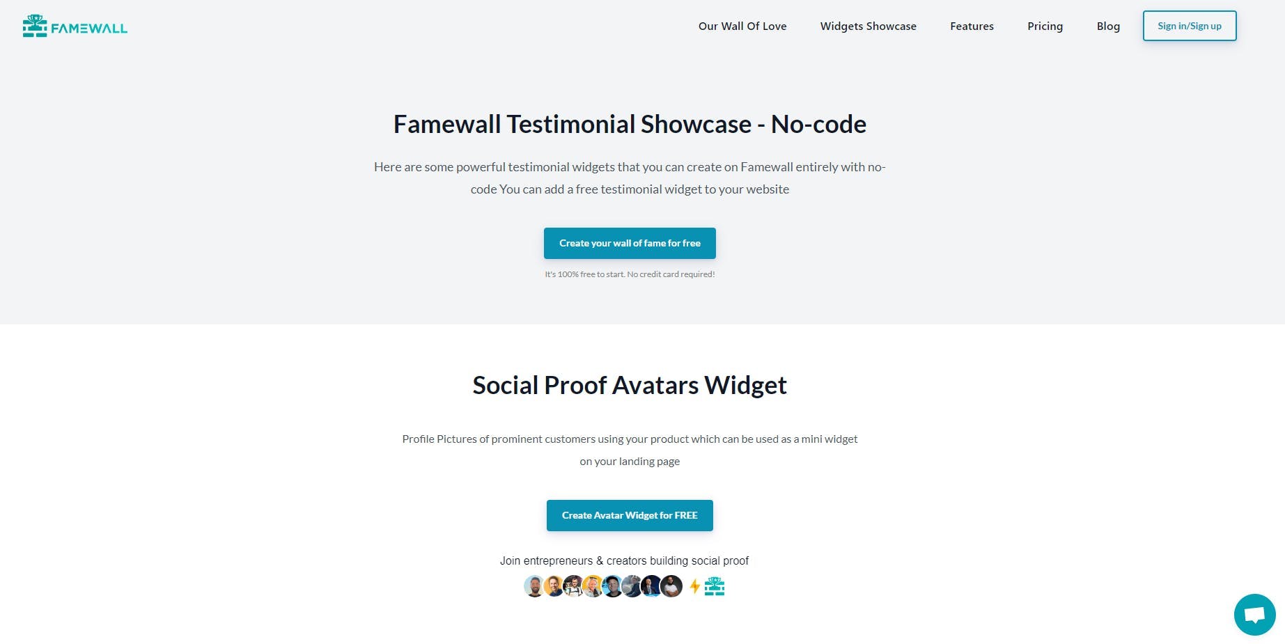
This guide will help you collect text testimonials and video testimonials from customers
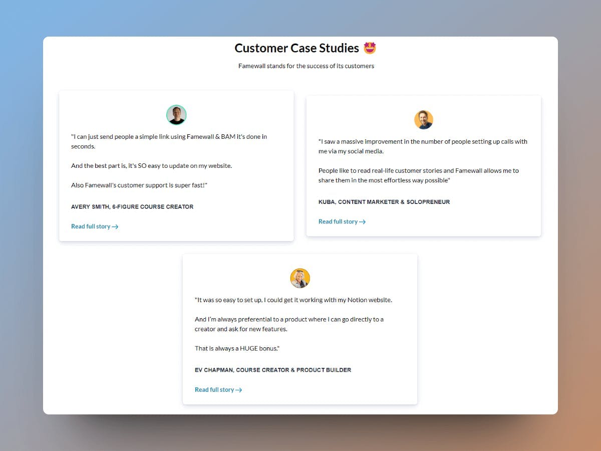
Showcase Customer Case Studies
Customer case studies work really well in increasing a low conversion rate as they show the transformation journey of an existing customer
This makes a potential customer visualize the outcome for themselves and make it easier to convert as a customer
Here are case studies displayed on Famewall's landing page
Use images
Give priority to images over text.
Humans process visual information 60,000 times faster than text.
That's why it doesn't come as a surprise that images instantly capture attention and convey messages better, even before visitors start reading.
Case Studies on Increasing Low Conversion Rates
Some websites have seen an improvement in their landing page conversions after following a combination of the above strategies.
Here are some interesting case studies of websites increasing their low conversion rate:
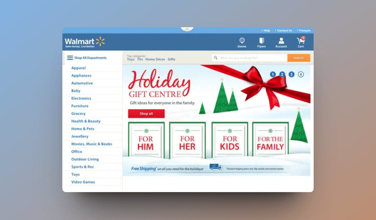
1. Walmart's Responsive Redesign
This was a case study shared by Walmart
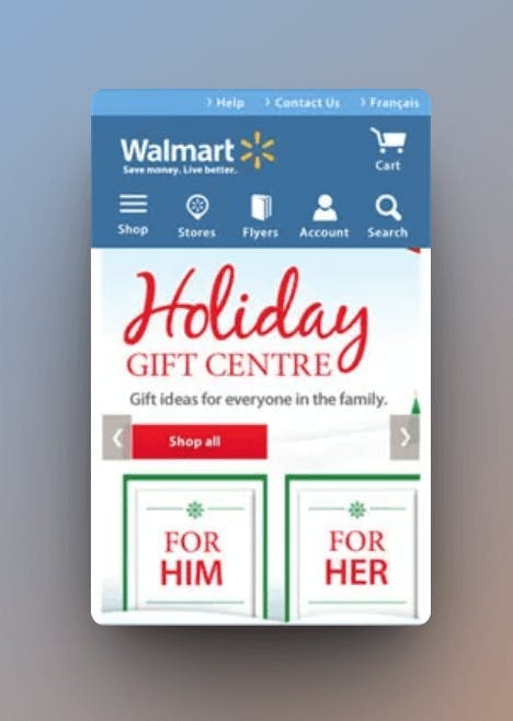
Walmart had significant traffic coming from mobile and tablet devices but had a low conversion rate since the website had a poor layout on mobiles and took a long time to load
They improved the user experience on their website and saw increase in conversions up 20% and mobile orders were up by 98%
Here was their website as displayed on desktops
And here's how it appeared on mobile devices after the redesign
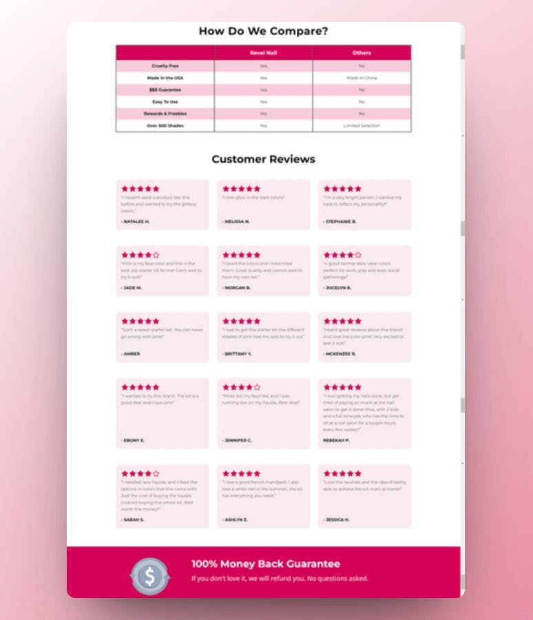
2. Revel Nail using social proof
Revel Nail was a company that was making 8 figures in revenue
They were focused on selling a wide range of nail related products such as dip powders, shades and accessories.
In this case study, they shared that they increased their landing page conversions from 0.5% to 4.4% just by highlighting key benefits in the copy and including a lot of social proof with testimonials, reviews on their landing page
Here's how their website appeared after including the customer reviews
In this aspect, Famewall can be of great help as you can create testimonial cards arranged in a grid fashion for free using this tool
Conclusion
In this article, we saw the different reasons why a landing page can have a low conversion rate and we also looked at possible ways to improve the conversion rate
This would help design a better landing page to make the best use of incoming traffic
We also saw a few case studies on how companies increased conversions using the mentioned techniques
Try Famewall for free to start collecting testimonials from customers with a simple link & display them as social proof on your websites without writing any code
